Welcome!

I'm Michael Miller, a programmer, level designer, and game designer from Toronto!

I'm a graduate of Sheridan College's Honours Bachelor of Game Design program, and I've dedicated a lot of my time to both school and personal projects, making games of various genres. Thanks for stopping by!

About Me!

Hi there! My name is Michael Miller! I’ve passionately played games for as long as I can remember, and I always knew I wanted to professionally create video games. Beyond producing something fun, I always strive to create unique worlds filled with challenge and exploration. I am passionate about programming and enjoy developing and optimizing the systems of a game. I also love level design, crafting worlds and filling them with set pieces, characters, and scripted events for the player to interact with.


My favorite games include Spyro: Year of the Dragon, The Elder Scrolls III: Morrowind, and Half-Life, each being a primary influence on me as both a gamer and a designer. Beyond playing games, I collect them too! I love music and dabbling with composing pieces of my own. I'm also an avid plant lover!


Contact Me!

My Works

My Game Design Works

My Level Design Works

My Programming Works

My Devlogs and Deep dives

LEVEL DESIGN, SCRIPTING

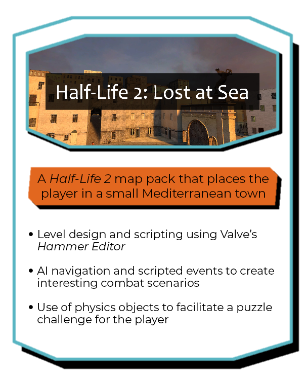
Lost at Sea is a level I created for my third-year Level Design class at Sheridan College. The player awakes in an old Mediterranean coastal town that has been taken over by the Combine, the antagonist force from Half-Life 2. The player must make their way through the level to ultimately locate the force’s base of operations and cut off their means of communication.

I utilized set pieces and scripted sequences throughout the level to give the player context, draw their attention, and make the level feel more alive. For example, the bottom left image was taken right after the player picks up the pistol for the first time. A zombie loudly bursts through the door, attracting the player's attention and motivating them to test out their new weapon.


Going Vertical with the Design


Based on a trip to Malta, I fell in love with the old, tight streets, colorful buildings and oriel windows, and the beautiful seaside! I felt that a narrow, hilly environment would make for an interesting environment that also catered to the typical design philosophy of "corridor-shooters". As such, I designed a linear journey that takes the player up and down the town's streets and through residential inlets.


As I wanted to use Half-Life 2's combat elements, I designed the level using Valve's Hammer Editor and Source SDK. Going into this project, I was aware of one caveat: the Source engine, at its core, is tailored toward enclosed spaces like hallways. The open, vertical nature of my level design meant I would need to keep heavy optimization in mind as I built the map.


Many steps were taken to optimize the map. I split the map into 2 sub-maps that the player seamlessly transitions to, just like Valve did for the Half-Life games.I ensured that any surface that wasn't viewable by the player wasn't assigned a texture (denoted by the bright yellow "NODRAW" texture in-editor). There were many areas where I had to manually dictate where visibility areas should be cut or clumped together by the map compiler, optimizing both the compilation process and runtime rendering!Lastly, I learned that Source handles the rendering of static models more effectively than brush geometry, so I converted many larger brushworks into models to help lessen the engine's burden.While time-consuming, I felt it was very rewarding to heavily optimize the map, as I didn't need to sacrifice much of my initial vision of the level, both gameplay- and art-wise!


Guiding and Enticing Players with Scripted Sequences


I wanted to employ multiple scripted sequences throughout the map to not only guide players, but make the environment feel dynamic and lived in as well. With Hammer Editor, I used the same entities and general pipeline that Valve would've utilized when developing Half-Life 2 and any Source game that followed.


I introduced Half-Life 2's staple enemy, the Combine Civil Protection, by setting up a sequence where the player witnesses a Combine officer attacking a citizen and pointing to the player, insinuating that they're next and should get ready for combat.After acquiring the pistol, a zombie smashes through a nearby door, intended to startle the player and supply them with the first target of their new weapon.


I sprinkled set pieces throughout the level to lead the player to new areas and provide some additional excitement.
By activating a radio signal and returning to a nearby area, a previously inactive vehicle revs up and smashes through a gate before exploding! This event opens up a new passage for the player and alerts them in a bombastic way.
As the player proceeds through the map, they will be ambushed by enemy groups or witness enemies fighting each other. These events help make combat feel less static and predictable while also fleshing out the world by sticking to conventions established in Half-Life 2. Zombies are mindless, hostile beasts that threaten both the player and the alien Combine, so it's only natural the Combine would retaliate toward the zombies as well.

LEVEL DESIGN, SCRIPTING

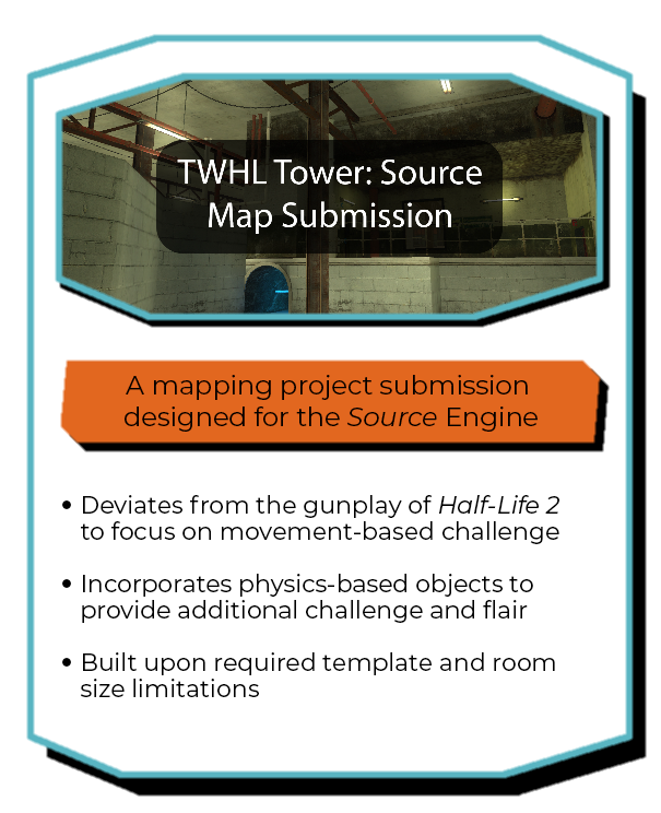
TWHL Tower: Source is the name of a community project hosted on the website The Whole Half-Life, a site dedicated to Half-Life modifications. From the end of June 2021 to the start of January 2022, I developed a map in the Source Engine for the project, deviating from the base game's gunplay and focusing on light puzzle and platform elements.

The project is in the midst of development, so my map will be available for play soon.


Working With Limitation and Aesthetic


The major requirement for this mapping project was to design an area within 1280x1280x256 units of space. Secondly, the area had to be accessible from a template hallway provided by the organizer, as a means of adhering to the tower theming.Due to the abundance of industrial props and textures in Half-Life 2 and the moderate amount of space available, I decided to design my level around a warehouse aesthetic. This aesthetic choice influenced what challenges I would include, and how they were presented.I also took influence from the surreal nature of the project's core theme: a bunch of disparate rooms assembled on top of one another within a tower. Since the project's concept isn't grounded in reality, I decided my challenges didn't need reasonable justification for being where they were either! This meant I could have laser beams, moving platforms, and exploding barrels without worrying about compromising the atmosphere of the project.


Going From Plan to Final Build


Once I had my industrial theme established, I started a paper sketch of the level before finalizing the design in Adobe Illustrator. When planning and looking over the size restrictions for the map, I felt that focusing on bite-sized movement challenges over combat would allow me to make good use of all three dimensions of the provided area.Stepping away from combat also meant I could experiment with concepts I haven't attempted before in Source, such as timing challenges and death traps. Being based on Half-Life 2, I did include some combat in the form of reflex challenges! Players are pitted against a few headcrabs throughout the level to break up the platforming gameplay, and two zombies serve as the final challenge!


To the left, you can see an early greybox of the starting area. At this point in development, I had some of the challenges implemented in a testable form, such as the Barnacle maneuver challenge (where the hanging creatures are, near the upper left corner of the image).Among the sea of orange and grey dev textures, I was getting a feel for the general texture usage of the map as well. Based on the picture below, I definitely found a set of textures I was satisfied with for the starting area at this point!


Here is what the starting area looks like in the final iteration of the level. I added plenty of prop models and trim textures to really sell the warehouse aesthetic. Yellow light sources are accompanied by glow sprites and old fluorescent tube props to reinforce the aesthetic further (and provide the player with light, of course).The lighting in particular took a lot of minor movements and map compiles to get just right, but I was able to afford the time thanks to the relatively small scale of the map, and I enjoyed doing it!

game/level design, programming

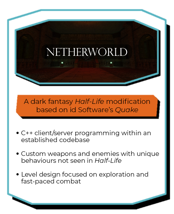
Based on the original Quake, this Half-Life modification transports the player to a dark and dismal medieval world. With no way back, the player traverses dimly lit halls looking for another exit, accumulating an arsenal of weapons to blast away increasingly formidable monsters and undead.


Netherworld has been a solo passion project of mine for the past three years. I began this project as a way to develop my C++ and level design skills and create a new experience for one of my favourite games. Since starting, I've been designing the various maps of the game, coding new items, weapons, and enemy AI.Working in the different areas of game design for this project has been enlightening and encouraging, allowing me to hone my skills across the board.


Using the Level Editor


Using the level editor J.A.C.K. (which is meant to mimic and enhance the features of Valve's Hammer Editor), I manipulate primitive shapes, known as brushes, to create the level geometry. Using mainly cubes, arches, and cylinders, I can create spiral staircases, pillars, giant door mechanisms, and more.Because the environments are based on the Eldritch settings of Quake, I can take liberties on realism and instead focus on eye-catching and alien set pieces.


I love creating outdoor areas! Since Half-Life doesn't have dedicated support for terrain as many modern engines do, it's up to me to manipulate the brushwork to make interesting landscapes.By splitting brushes into triangular shapes, I can then manipulate their vertices to simulate cliffs, river banks, and more! It can be a time-consuming process, but it's always rewarding in the end.


Entities add interactivity to the world: enemies, doors, lights, and much more. Some of the stand-out uses of entities I took advantage of include creating scripted sequences, populating the world with items and enemies, and creating interesting lighting.Using a community-modified version of Valve's Half-Life SDK, I created my own weapons and enemies. I was able to define my new entities in a file that the level editor parses, allowing me to place them like any other entity in my maps.


Creating an Open-Concept Space


I'm a big fan of circular level design; when you make the player start in one area and have them return to it later, the areas you explore feel more alive and important. The player wants to open a door, but they can't yet, so they naturally look elsewhere for the key.Ultimately, the journey is still very much linear, but by having light backtracking and overlapping areas, the player doesn't feel like they're just following a straight line.


I applied the same philosophy to side paths as well. Backtracking with nothing new to experience can feel like a waste of time, so providing an exit back to an existing area makes the player feel like they're still progressing forward. The player also shouldn't feel like they've missed out on content on the main path since they're back to somewhere they've already been.Based on my own experience playing games, I love providing players with the same "eureka moment" I feel when I'm led back to a previously explored area!

Using a modified version of Valve's Half-Life SDK, I have created my own weapons and enemies, and other entities, working on both the client and server-side of the game.

PROGRAMMING, GAME DESIGN

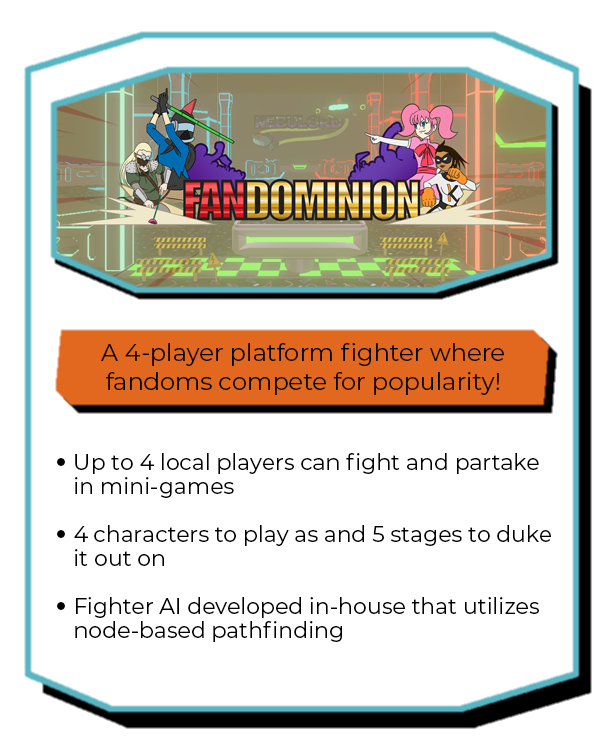
Fandominion is a platform-fighter game where up to 4 players compete for the highest point score by fighting each other and participating in quick mini-games before the time runs out.

There are 4 playable fighters, 5 stages to duke it out on, and 2 game modes to play!

Creating AI That Can Move Like a Player


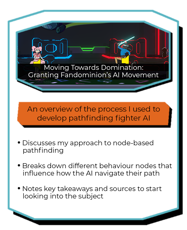
As part of the AI development team, my primary task was implementing movement behaviour for the virtual fighters. To make navigation efficient for the AI, I created a node-based pathing system. By placing a few nodes on a given stage, the AI can decide ideal paths and navigate to target players.


Nodes are very flexible, with many variables accessible to the developer, such as the distance at which AI players will consider jumping to the node, or whether the node will be moving with a platform or not. I implemented some Unity Editor functions to help expedite the implementation process, allowing me to automatically link nodes and populate the node graph, detect and pair any moving platforms with a node, and more, at the click of a button!


I implemented a Finite State Machine to handle movement behaviour. The AI can chase along a path, directly approach, jump towards a target, etc. With a state machine, distinct behaviours and connections between other states could be clearly defined. Additionally, I simulated holding down and letting go of the jump input in code to ensure that jumping didn't feel static for the AI, but more human instead.


Lights, Camera, ACTION!


To smoothly track up to 4 players, I implemented Unity's Cinemachine system. I fine-tuned camera variables such as movement speed and damping, dead zones, and zoom, until a satisfying balance between playability and look-ahead was achieved, dictated by both developer and player testing.


I used Cinemachine to enhance play in many other ways as well. With a line of code, my camera controller can be told to zoom out to give players a full view of the stage. This functionality is used when mini-games or stage hazards appear on screen, grabbing the players' attention and allowing them to always track whatever event is currently happening.


I also implemented screen shake to specific attacks and events to make actions even more satisfying. Whether it's landing that last hit from a combo or a giant laser beam firing off in the middle of the stage, screen shake helped sell the weight of many different actions!

game/level design, programming

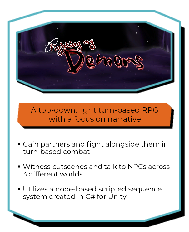
Having a bad day, the player character jumps into a puddle that transports them to another realm! This new world is home to the character’s inner demons. The demon Fear quickly allies with the player, promising to help them escape if they can help him overtake an entity known as Void.


Over the course of a semester at Sheridan College, my friend and I conceptualized and developed this game in Unity with a focus on narrative. I took the opportunity to try new things as both a designer and programmer by implementing turn-based combat and a node-based scripted sequence system. In tandem with my friend's dialogue system and art, we were able to pack a lot of personality and story into the game's 3 maps.

PROCESS WORK

The nodes of my scripting system can execute one of many different actions before moving on to the next specified node. These actions include moving the specified object to the position of the node, fading the screen to black, shaking the screen, or making a character talk via my friend's dialogue system. The chain of events to be executed can be visualized via Unity’s “Gizmo” function.

game/level design, scripting

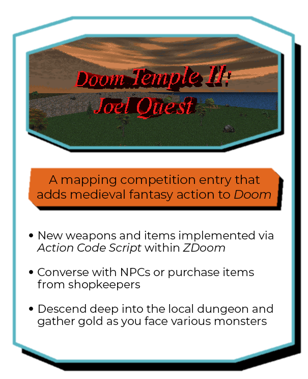
Created as a submission for a Doom II mapping contest held by Twitch streamer "Vargskelethor", Doom Temple II was done within roughly a month while I was in my last year of high school. The modification converts the standard shooting of Doom II into a light first-person dungeon-crawling affair, using assets from Bethesda's Daggerfall. The player has medieval weaponry, spells, and potions at their disposal.


I added traditional fantasy RPG elements to the game, like gold, potions, and spells, viewable on the status bar at the bottom. The player can collect gold from defeated monsters and buy items from shopkeepers in town. Scripted sequences give the player direction, purpose, and can alter the map in some way.I wanted to add a narrative and some dialogue to make the level meaningful and something more than just a monotonous arena melee. Going into this contest, I aimed to make something unconventional that defied Doom's signature run-and-gun formula, and I believe these features allowed me to accomplish that goal.

PROCESS WORK

Using the level editor GZDoomBuilder, I was able to write scripts in the engine's proprietary "ZScript" language, as well as new objects. Pictured above is an overhead view of the town on the left, with a sample of the script that introduces the player to the king on the right. Through the engine’s scripting language, I could make the player look at other NPCs, display text with various attributes, alter functionality of objects within the level (like opening doors), and more. In total, 32 different scripts were written and executed throughout the level!
Elemental weaknesses

level design

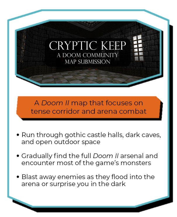
This GZDoom level was created between June and July 2021 for a community mapping contest known as "RAMP" on the Doomworld forums. The player must make their way through castle halls, caves, and open combat arenas to survive!


I wanted to focus on combat, thus there are multiple arena sections throughout the level where monsters gradually flood in. Due to the larger scale of the level, I wanted to take the player through multiple environments to keep them engaged, including gothic hallways, outdoor areas, and dark caverns.

PROCESS WORK

I employed a roundabout motif when designing the level, with many rooms and halls being circular or curved, and having the player return to previous areas from somewhere they newly explored. I thought this would help make the level feel more organic and visually interesting compared to a more rigid design.

game/level design, programming, art

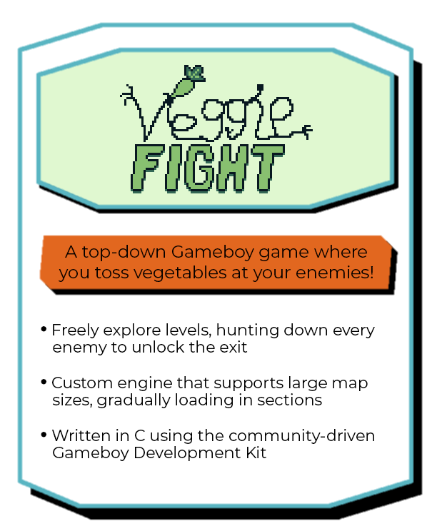
Monsters have taken over your island home to steal all the vegetables you've been growing! Weaponize your crops by throwing them at your enemies and drive away the monster threat!Developed in C using the Gameboy Development Kit, I wrote my own 2D top-down engine for use with actual Gameboy hardware. With the primary engine systems implemented, I aim to have a few playable demo levels out by the end of the year!

3D Platformer cameras:
How Can they affect player behaviour?

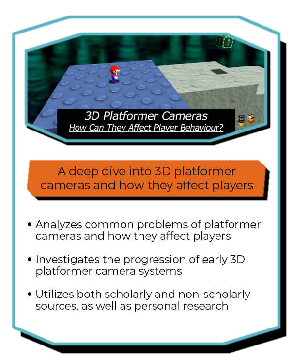
For one of my fourth year classes at Sheridan College, I created a deep dive video that analyzed how Super Mario 64's camera affected player behaviour and what steps were taken to address those issues in 3D platformers that followed. I applied both academic and more casual research findings, and did some investigating into games myself.As I was implementing the camera system for my capstone project at the time, it was very insightful to see what some common pitfalls were and learn more about cultivating a positive player experience using the camera!

My Resume